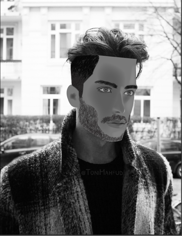
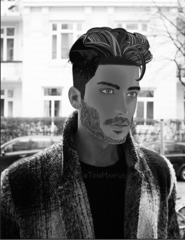
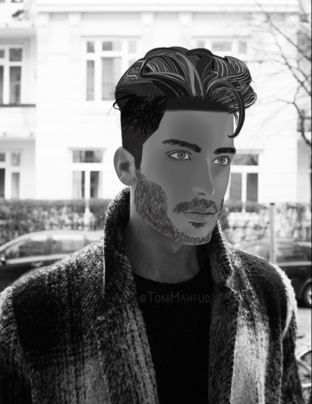
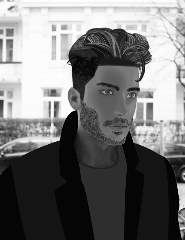
Illustrator Portrait
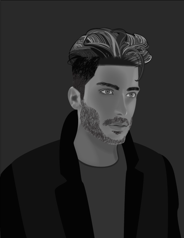
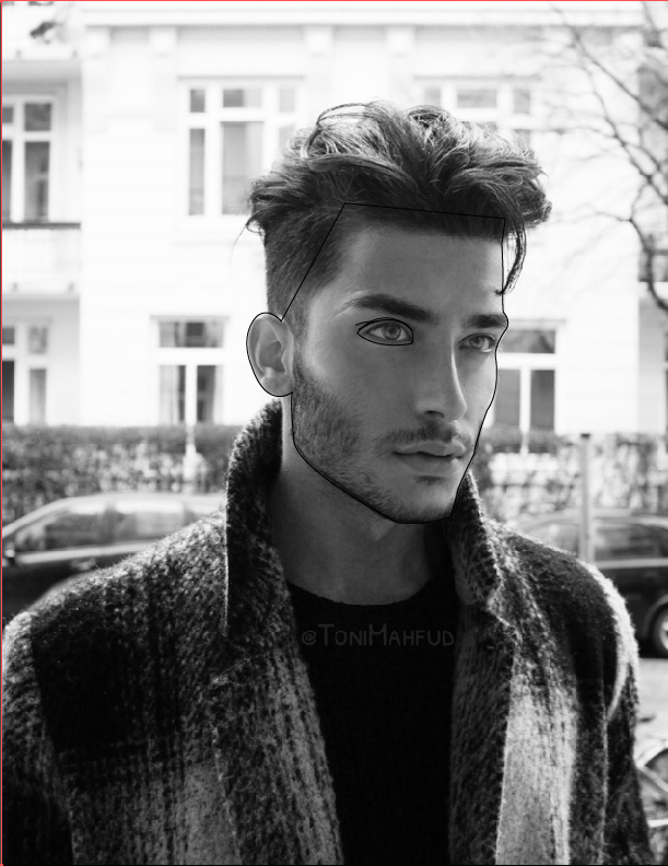
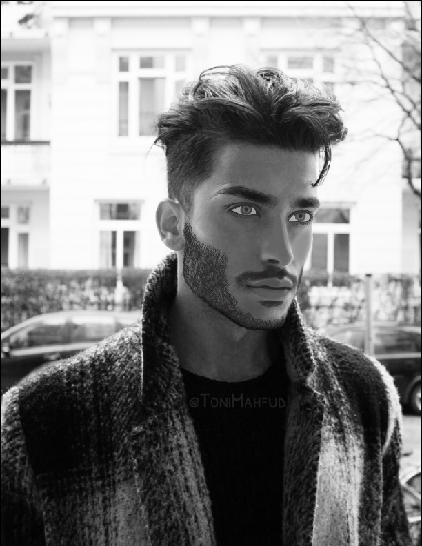
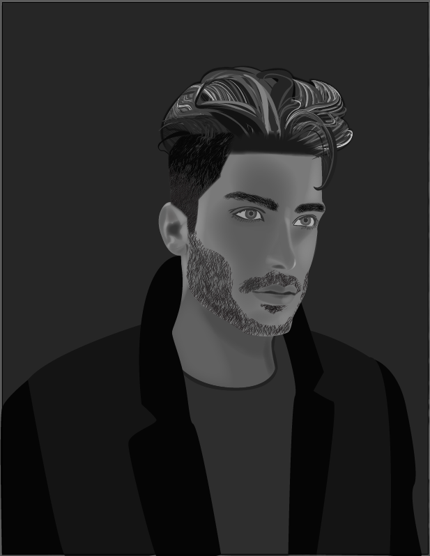
Toni Mahfud is an artist, model, photographer, and social media devotee. He is only 21, yet he travels the world with friends and fulfills his dreams and goals. I chose to draw him because he's a really beautiful man and I envy what he has accomplished in life already at such a young age. Toni is an amazing artist that specializes in photorealistic portraits. When I showed Mr. Means his work, he was blown away.
For this portrait, I opened the original photo in Photoshop and converted it to grayscale. I then transferred the photo to Illustrator and used only the pen, symbol sprayer, and eyedropper tools to create this portrait. In order to create shadows and and highlights, I created a shape filled with color that matched the shadows and highlights on the original photo and feathered the shape to create very soft edges. I wanted to make this portrait as real as possible, but it required a lot of creative interpretation.
For this portrait, I opened the original photo in Photoshop and converted it to grayscale. I then transferred the photo to Illustrator and used only the pen, symbol sprayer, and eyedropper tools to create this portrait. In order to create shadows and and highlights, I created a shape filled with color that matched the shadows and highlights on the original photo and feathered the shape to create very soft edges. I wanted to make this portrait as real as possible, but it required a lot of creative interpretation.
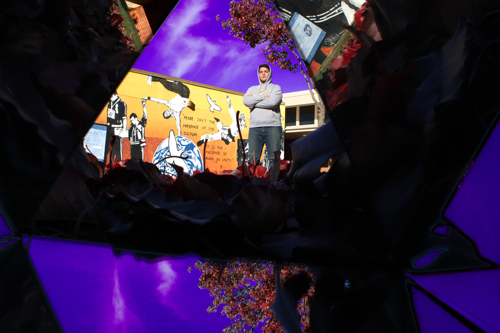
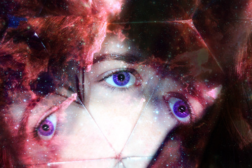
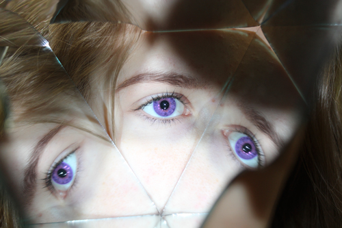
Abstract/Cut Up Portrait
This project was really neat and I enjoyed creating all three pictures. Mr. Means built two triangular prisms made of mirrors, and I shot through them to create an abstract portrait. The picture with the purple sky was shot by our mural on the far east side of our campus. I chose to color the sky purple because that is one of our school colors. All of the imagery in this photo is imagery of the school, with one of the focal points being our school mural which is meant to be a symbol of our school pride. I posed in a proud manner in order to echo this. The second picture is of my friend Diana's eye. The original picture was not appealing to the eye at all, but I added a curves layer which allowed me to adjust the levels of exposure, contrast, colors, etc. in order to make some of her facial features stand out. I also took a brush and altered the area around her eye to be smoother and softer. I colored her eyes purple, because that's her favorite color, but then I also added an image of a galaxy as an overlay on a layer mask and colored her eyes purple to match the surrealistic imagery.
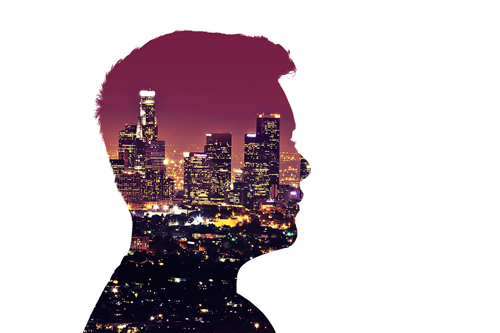
Surreal Profile Silhouette
Version 4 |
Version 5 |
(two extra versions that I made a day late)
Version 3
Version 2
Version 1
1. Explain the imagery used within your profile silhouette.
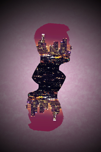
-Version 1: In this version of my profile silhouette, I used the Los Angeles skyline. I'm in love with Los Angeles and I want to move there once I graduate high school, so I used this picture. I think the viewers can interpret that this is something I'm thinking about and wishing for from the image inside my silhouette.
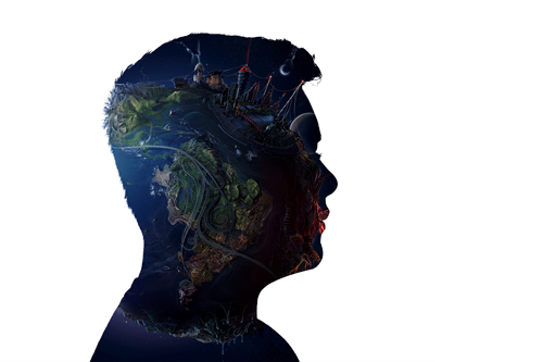
-Version 2: In the second version of my profile silhouette, I found a surreal image/drawing of Earth to use in my project. I thought that it was visually appealing and it lets you see a different view on Earth (literally) since the image is three-dimensional and has a lot of depth and shading.
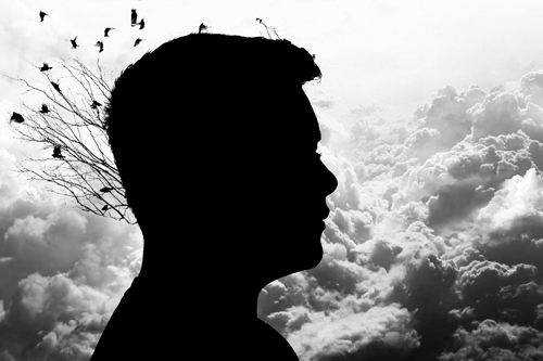
-Version 3: In my third and final version, I used a picture of birds flying away from a tree. In order to get the two-dimensional "drawn" quality, I opened the original image in Adobe Illustrator and created an Image Trace. Once I completed the Image Trace, I then imported it into my photoshop document and placed it behind my silhouette (which had now been filled in with black to match the birds leaving the trees). I chose a picture of clouds and made a black and white adjustment layer to make sure the picture was grayscale. I made a connection between birds and clouds because when birds fly, they usually fly pretty high. When you look into the sky, you can usually see some birds flying. There are often times when there's a cloud or two above the birds, which makes your eyes perceive what your viewing as clouds being behind the birds - not above. I thought that if I included clouds as the background of my profile silhouette version 3, then the viewer could make a connection between birds and the sky.
2. What do you want people to notice about your work?
-All versions: I want people to notice that a lot of time and effort went into these three versions. I spent a lot of time with selecting myself and learning the "refine edge" tool. I also learned a lot more about layer masks and how to edit images to make them more visually appealing (like adding a vignette around the part of the image that's showing in your silhouette). People should notice that I didn't just slap my work together - I worked very hard on all three versions and I'm proud of my work.
3. How does your design show creativity, skill and agency?
-All versions, but mainly version 3: I used different and unique images in all three versions. I didn't just use the first image that popped up when I searched for something or use a stock image with a low resolution. I used the search tools within Google to find high quality images. All three versions are unique in their own way because each image conveys a different message; Version 1 is more of a dream/goal that I have, Version 2 has more to do with the surrealness of the whole project and how some things are bizarre but also neat/intriguing and makes you study the image/object to better understand it, and Version 3 is conveying the message that I had typed in the first answer for Version 3. I believe my design(s) show agency because I went through a tedious process of selecting myself and making sure it was done correctly, and because I attempted to use a technique I had no idea how to actually execute. I experimented and eventually found out how to do it. . . on my own. The reason for that is because I was so eager to finish the third version so I took it home with me. I worked on it on my laptop and finished at home instead of waiting to finish during class. I created three different designs (or versions) and I think that shows a lot compared to my other classmates who sometimes only do one version or don't really finish well. My work had a lot of thought put into it.
-Version 1: In this version of my profile silhouette, I used the Los Angeles skyline. I'm in love with Los Angeles and I want to move there once I graduate high school, so I used this picture. I think the viewers can interpret that this is something I'm thinking about and wishing for from the image inside my silhouette.
-Version 2: In the second version of my profile silhouette, I found a surreal image/drawing of Earth to use in my project. I thought that it was visually appealing and it lets you see a different view on Earth (literally) since the image is three-dimensional and has a lot of depth and shading.
-Version 3: In my third and final version, I used a picture of birds flying away from a tree. In order to get the two-dimensional "drawn" quality, I opened the original image in Adobe Illustrator and created an Image Trace. Once I completed the Image Trace, I then imported it into my photoshop document and placed it behind my silhouette (which had now been filled in with black to match the birds leaving the trees). I chose a picture of clouds and made a black and white adjustment layer to make sure the picture was grayscale. I made a connection between birds and clouds because when birds fly, they usually fly pretty high. When you look into the sky, you can usually see some birds flying. There are often times when there's a cloud or two above the birds, which makes your eyes perceive what your viewing as clouds being behind the birds - not above. I thought that if I included clouds as the background of my profile silhouette version 3, then the viewer could make a connection between birds and the sky.
2. What do you want people to notice about your work?
-All versions: I want people to notice that a lot of time and effort went into these three versions. I spent a lot of time with selecting myself and learning the "refine edge" tool. I also learned a lot more about layer masks and how to edit images to make them more visually appealing (like adding a vignette around the part of the image that's showing in your silhouette). People should notice that I didn't just slap my work together - I worked very hard on all three versions and I'm proud of my work.
3. How does your design show creativity, skill and agency?
-All versions, but mainly version 3: I used different and unique images in all three versions. I didn't just use the first image that popped up when I searched for something or use a stock image with a low resolution. I used the search tools within Google to find high quality images. All three versions are unique in their own way because each image conveys a different message; Version 1 is more of a dream/goal that I have, Version 2 has more to do with the surrealness of the whole project and how some things are bizarre but also neat/intriguing and makes you study the image/object to better understand it, and Version 3 is conveying the message that I had typed in the first answer for Version 3. I believe my design(s) show agency because I went through a tedious process of selecting myself and making sure it was done correctly, and because I attempted to use a technique I had no idea how to actually execute. I experimented and eventually found out how to do it. . . on my own. The reason for that is because I was so eager to finish the third version so I took it home with me. I worked on it on my laptop and finished at home instead of waiting to finish during class. I created three different designs (or versions) and I think that shows a lot compared to my other classmates who sometimes only do one version or don't really finish well. My work had a lot of thought put into it.
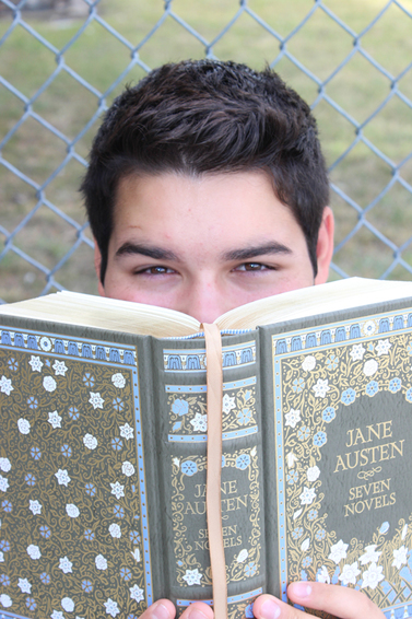
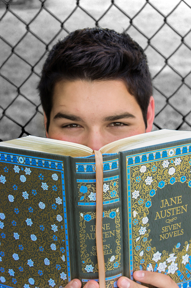
Tape Face Portrait
|
|
Describe your process for editing your image -
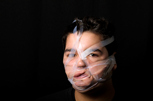
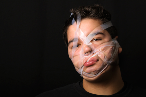
I uploaded the pictures to my computer and edited them in Adobe Bridge using camera raw. I first edited the overall look of the photo (exposure, contrast, tint, shadows highlights, whites, and blacks) and then proceeded to go over my chin/neck with an adjustment brush. I turned down the exposure on the brush because I hate my double chin, and the tape just made it more noticeable. I tried to make my neck and the underside of my chin to have more shading and to give it a more dramatic look while also minimizing the amount of the skin that was being squished by the tape. I saved a high quality JPEG version of both and then saved a web-optimized version of both to post on my portfolio.
How does this type of distortion affect the way you see / perceive someone?
This type of distortion affects the way I see someone in one of two ways. One way is that you could see someone's tape face picture and think, "Oh they look good, they really can pull anything off." The other way is more like, "Yikes... They don't look so good. That sucks they had to do this project." I feel like people are going to say that (or did) about me in this project. Honestly, I don't care, it's just the feeling of letting my guard down and making myself post this assignment that I have to get over.
Explain what you want people to notice about your work
I want people to notice that even though you may not look good or you're not as pretty as the other people who do the same thing as you doesn't mean you're not beautiful. It just means that other people look good doing one thing and you look good doing another. (Look at the last picture in my previous project below). I just happen to look good (nice/attractive/visually appealing) in the Hands on Face Portraits. I guess this project just shows a different side of me.
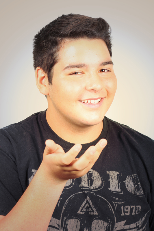
Hands on Face Portrait
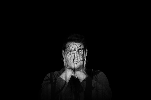
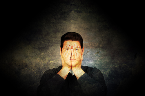
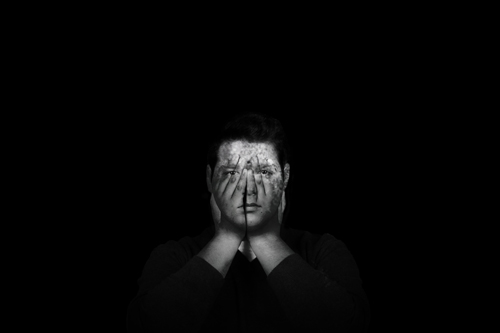
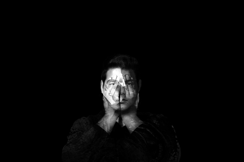
1. Explain the process used to take and edit your image. Include references to camera settings, layer blending modes, adjustment layers, layer masks, dodge and burn, etc..
2. What do you want people to notice about your work?
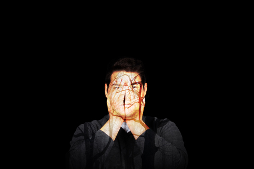
I don't remember the exact camera settings for this project, but I do remember the process. I needed a lot of help with this assignment because I missed one day of class due to the PSATs. When I came back the next day, almost everyone in the class was done with their first versions of this project. Once I learned the process of creating an image like this, it became easier with each version I produced. I learned how to use non-destructive editing (the right way) and how to non-destructively dodge and burn. When I say "the right way", I mean that I finally understood how use non-destructive editing by creating layer and clipping masks. I learned more about adjustment layers and what the fine mechanics of them are.
I would like people to notice that this isn't just another portrait. Mr. Means was talking to me and my friend about how selfies are vain and somewhat seflish. Most selfies aren't vain or narcisstic, but then a second friend expressed their opinions about how the narcism comes in when you hit the "post" button on whatever website your posting it to. I agree with that. This project was different because 1) it isn't a selfie, and 2) because this is art.
2. What do you want people to notice about your work?
I don't remember the exact camera settings for this project, but I do remember the process. I needed a lot of help with this assignment because I missed one day of class due to the PSATs. When I came back the next day, almost everyone in the class was done with their first versions of this project. Once I learned the process of creating an image like this, it became easier with each version I produced. I learned how to use non-destructive editing (the right way) and how to non-destructively dodge and burn. When I say "the right way", I mean that I finally understood how use non-destructive editing by creating layer and clipping masks. I learned more about adjustment layers and what the fine mechanics of them are.
I would like people to notice that this isn't just another portrait. Mr. Means was talking to me and my friend about how selfies are vain and somewhat seflish. Most selfies aren't vain or narcisstic, but then a second friend expressed their opinions about how the narcism comes in when you hit the "post" button on whatever website your posting it to. I agree with that. This project was different because 1) it isn't a selfie, and 2) because this is art.
Tiny Pants
-1/80
-f/36
-1600 ISO
This assignment is called Tiny Pants. My group and I found a cool pair of spacey sweatpants online, so we scaled them down in Photoshop and printed them out. We then attached the cutout of the sweatpants to a skewer. Diana held the pants, I took the picture, and Janae positioned Sean. The pants would only fit Sean since he was the only one with long legs, and he agreed to let us use him as our model. I think for the amount of time we had the amount of hurdles we had to jump over, we produced a pretty good project. Unfortunately the camera was positioned very low, so Sean was close to the upper edge of the frame. I think that's something I could improve on for the next project. I'd like people to notice that the pants are very small, so that's why I included Diana's hand on the side to show just how much of a difference there is between the two objects.
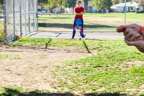
Forced Perspective
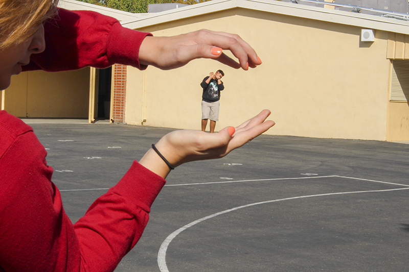
This assignment is called Forced Perspective. My group and I were asked to create an image that made it seem as though one object in the front was being manipulated by one object in the back (or vice versa). For this image, Member 1 took the picture, Member 2 had her hands positioned so that it would look like Member 3 (me) was about to be grabbed by the hands. Member 2 was actually very close to the camera, and I was very far away - I'd have to say 20 yards at the most. To make sure everything was in focus, we had to use the highest aperture on the camera. My group and I had a lot of fun doing this project. I'd like people to notice that I edited the clarity, brightness, contrast, and vibrance in this picture to make sure it was sharp and vivid. I also zoomed in on myself to make my body sharper so that it would appear as clear as it possibly could (so that when someone looks at this picture, I wouldn't be as blurry as the background).
Green Screen Project
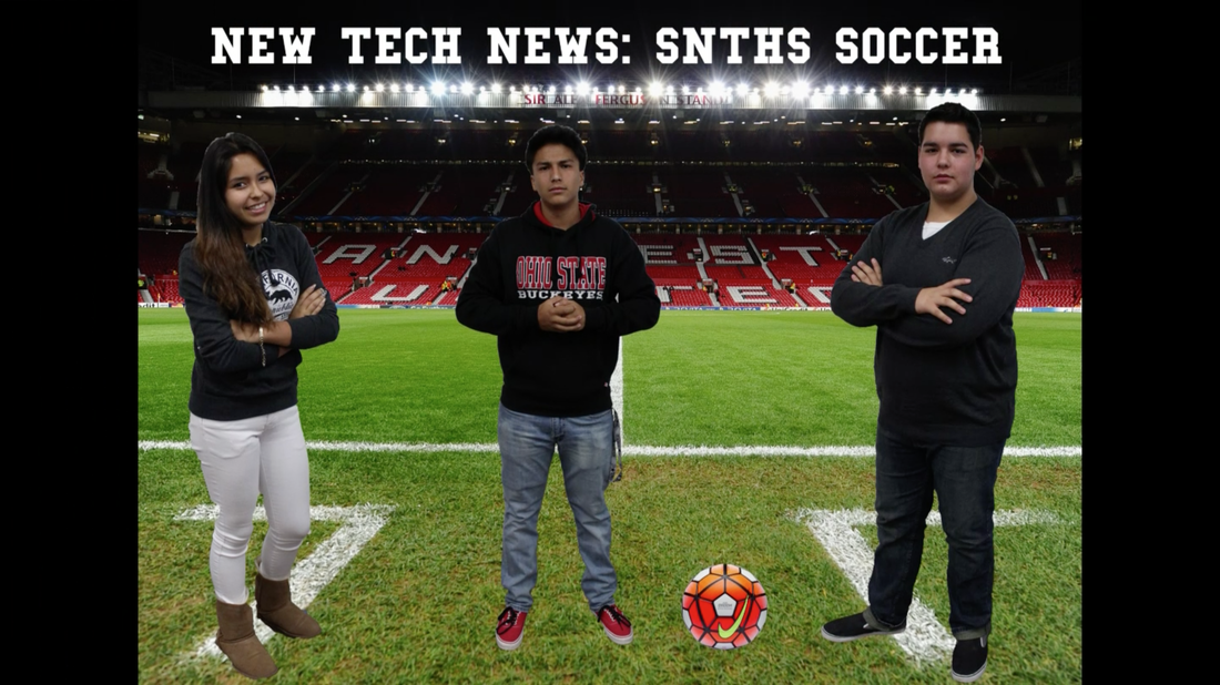
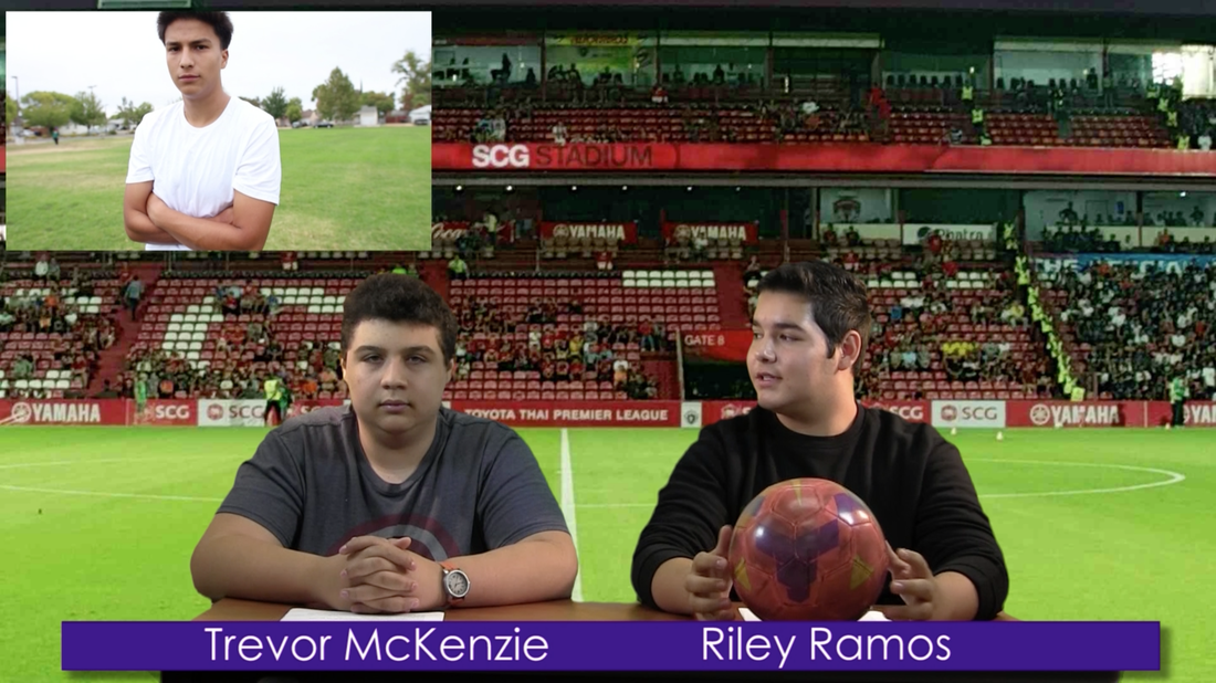
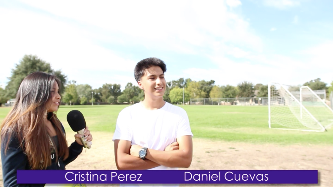
Our green screen concept was to make us appear as though our video was a segment on the New Tech News. We wanted it to appear as legit as possible, so we even borrowed a microphone from Means. Since Daniel is on the soccer team, him and I both thought it would be more fun to report on something that he knows and could teach us about as we filmed everything. My group and I were passionate about this because it's part of the school and we got to have a lot of fun filming it. I helped write the script, filmed, wrote cue cards, and edited the whole project. I was the group member that learned how to use Adobe Premiere Pro and I got to somewhat teach my group members. We all researched how to use Premiere Pro. Cristina was the reporter, and Daniel was the person showcased in the soccer videos/the player interviewed. He helped write the script too. Our final product is a polished, well put-together segment that is able to be featured in the New Tech News. One success that my group had was how well the final video flowed together. I think the only improvement would be to have everyone rehearse their lines a little more, because I had to look down at my paper a few times, and Cristina had to use cue cards. That's not a bad thing, but I think that if Cristina would have rehearsed more then than would've made her lines sound more natural and not as forced or like she was reading them off of a card. Overall, I'm proud of our group's work because we put a lot of time and effort into it.
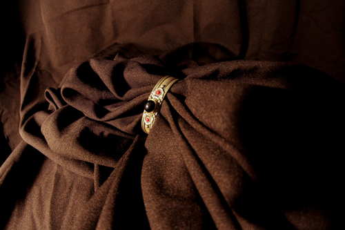
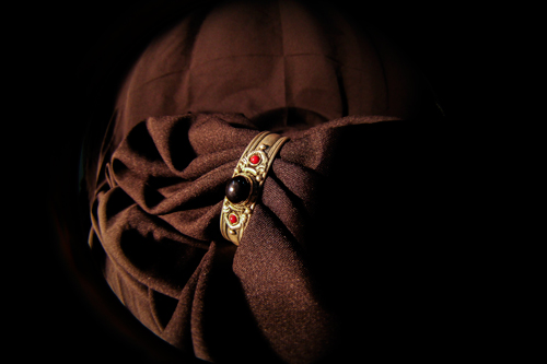
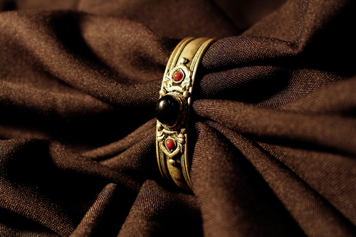
Macro Photos
|
Convex Lens
1/250 ISO 800 f/? |
Fisheye Lens
1/250 ISO 800 f/? |
Regular Lens
1/250 ISO 800 f/? |
I chose the object in my photos because I thought it had an interesting backstory. This bracelet was made in Thailand, and then somehow it was brought over to Hawaii. The stone in the middle is onyx, and onyx symbolizes strength, good health, and willpower. It's believed to help people fulfill their dreams and achieve their goals, which is something I really need. I found this bracelet at the bottom of a box in this really cool thrift store called "Peggy's Picks". I make sure to go there at least twice each time I go to Hawaii. I'm probably going again this winter, and I can't wait to take more pictures.
Droste Effect v2
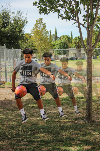
My idea in this edit was to demonstrate everything we've learned about the droste effect and how we can apply other editing techniques to our work. This picture (the original one) wasn't even planned. The student just happened to be playing with the soccer ball and I got a shot of him. The first thing I did is opened the picture in Photoshop. I then outlined Daniel by using the quick select tool and zooming in to make sure I got every detail. I right clicked on the outline and selected "make selection". I held down the "alt" key and dragged out 4 copies of Daniel. After that, I "command-T"'d the first copy of Daniel (the one closest to the original picture) and scaled him down to 75%. I did the same for each copy after that. Then, I turned the two last copies off and selected the tree trunk. I right clicked on the tree trunk and selected "layer via cut", then turned the previous two copies of Daniel back on. I moved the new tree trunk layer above the last two outlines to make Daniel's copies appear behind the tree. When that was done, I saved the file as a .jpg and opened it in Bridge to edit it. I edited the colors, the contrast, the highlights and shadows, and then the saturation of the ball. I'm not quite sure what I want people to notice about my work, but I know that this was just a spontaneous picture/edit. I believe this is different from my previous work because it was a little harder since I had to think about perspective (like the tree trunk layer) and how to scale the copies down by 25% each time to make them appear farther away.
Droste Effect v1
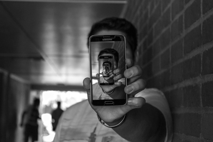
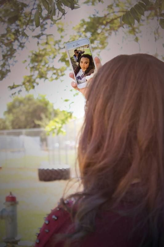
1. What is the droste effect? Describe / define the technique.
-The droste effect is when an object or image is repeated and scaled down each time.
2. How did you edit your photo to improve your design?
-I edited my photo in photoshop after I used the droste effect. I used the black and white option under the appearance panel, and I also used a layer filled with 50% gray.
3. How does your design / image show both creativity and skill?
-My image is showing anonymity, and I feel that it makes you think that my face will be revealed in one of the repeats, but it never is. I think this is a very creative photo because of that idea I incorporated into it.
4. What do you want people to notice and / or know about your design?
-I want people to notice the anonymity in my photo. Obviously you can tell it's me, but for people who don't know me and just saw the picture they don't know who it is behind the phone.
Depth of Field
|
- f/4.5
-1/500 -ISO 100 I opened the photo in Adobe Bridge and adjusted the exposure, highlights, shadows, tint, contrast, whites, & blacks. |
-f/18
-1/200 -ISO 400 I opened the photo in Adobe Bridge and adjusted the exposure, highlights, shadows, tint, contrast, whites, & blacks. |
I wanted both photos to be clearer, more vibrant,
and more defined, so I adjusted each setting to
what I thought looked good. I'd like people to notice
that this was just a group of friends having a good time
taking pictures. We enjoyed getting into position and
making sure everything was in place. It was hard to keep
a straight face during the whole thing because we were
taking a long time to set up, but in the end it was a fun task.
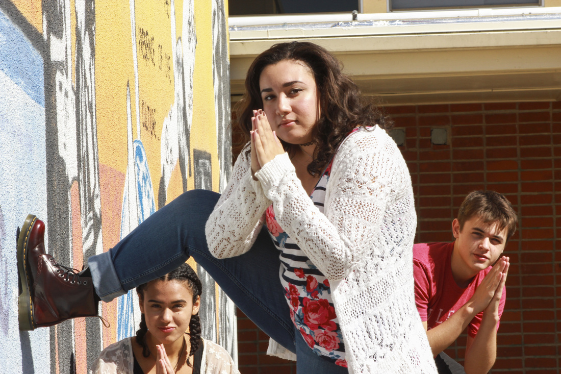
Selective Desaturation
|
|
|
This assignment was called "Selective Desaturation", which means that you select an object or area in a photo and either make it black and white or make the background black and white. I used the Quick Selection tool, the Quick Mask tool, the Black and White Adjustment setting, and the brush tool.
|
Photographic Tones
|
Picture 1
-Layer Blending Mode Used: Linear Burn -Gradient: Gold-Sepia Picture 4
-Layer Blending Mode Used: Darken and Normal -Gradient: Sepia-Cyan & Foreground to Transparent |
Picture 2
-Layer Blending Mode Used: Lighten -Gradient: Sepia Antique Picture 5
-Layer Blending Mode Used: Multiply -Gradient: Cobalt-Iron 1 |
Picture 3
-Layer Blending Mode Used: Soft Light -Gradient: Sepia-Selenium 2 Picture 6
-Layer Blending Mode Used: Lighten, Soft Light, & Normal -Gradient: Sepia 4, Foreground to Transparent, & Copper 2 |
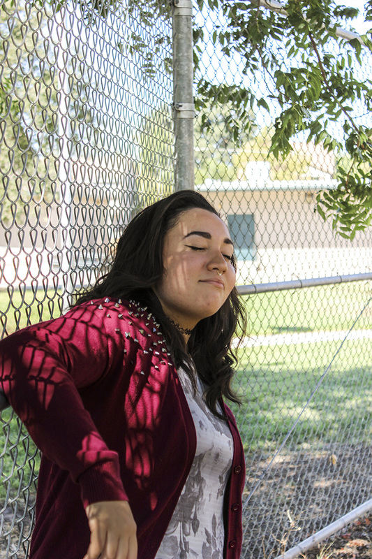
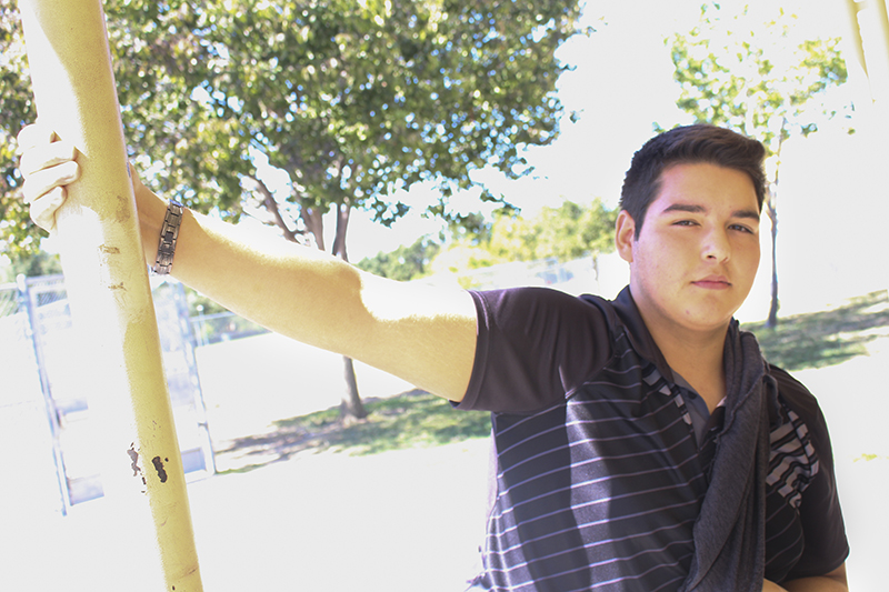
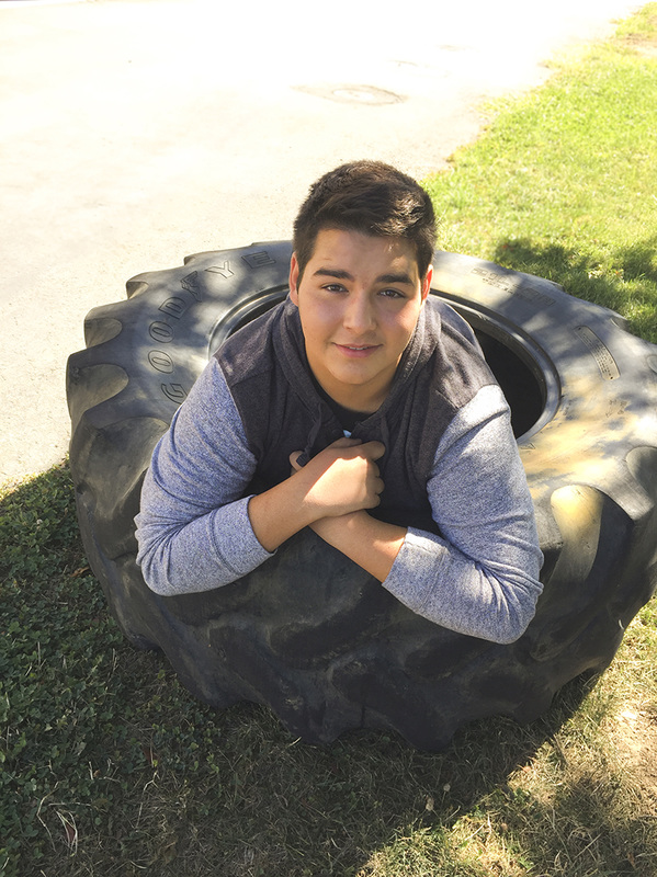
First Week Photos
These photos were taken during the first week of VISCOM. My partner Janae & I had a lot of fun taking these pictures. At first, some of the pictures were overexposed or had flat coloring. I used Adobe Bridge to adjust the exposure, the shadows, the colors, and the sharpness. I also used a brush to emphasize certain facial features or to make the shadows darker on our clothes or hair. I think people should just take note of the hard work that went into this. These photos were taken over the course of two days, and they took two more days to be edited. I really believe these are some good photos.
