
Welcome to my Portfolio!
My name is Riley Ramos, and I attend Sacramento New Technology High School. Here you will find the work I have done in Digital Art & Design, Spring 2015.
Thank you for visiting!
Thank you for visiting!

|
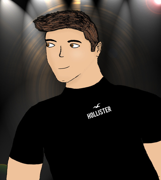
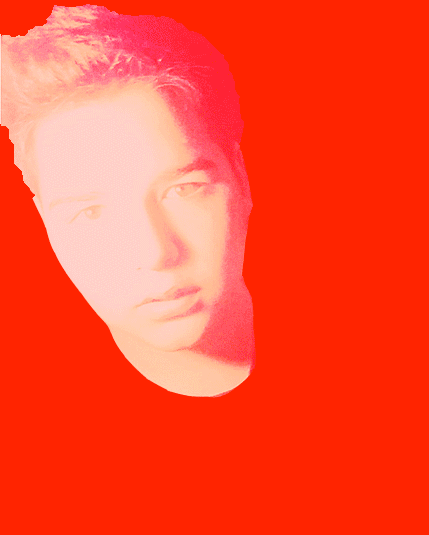
Self PortraitTwo of the most important tools that I learned in this class were the Magnetic Lasso tool and the Bamboo Tablet for drawing. The magnetic Lasso tool really helped me when it came to selecting different areas to color or shade. Learning to use the bamboo tablet was fun and helped get the coloring and drawing done in half the time it would normally take me with the regular mouse. I won't lie, the project became stressful and demanding at times, but in the end it was an overall fun process. I'm glad that I took time on each piece of the project.
|

|
Rare Shoe AdFor this project, we were supposed to create a shoe ad from scratch. The hardest part for me was perfecting everything and making sure each object was in it's place. I learned how to warp text and adjust lighting. This was a fun project because I based my shoe off of the movie Kinky Boots.
|
Stop Smoking Ad
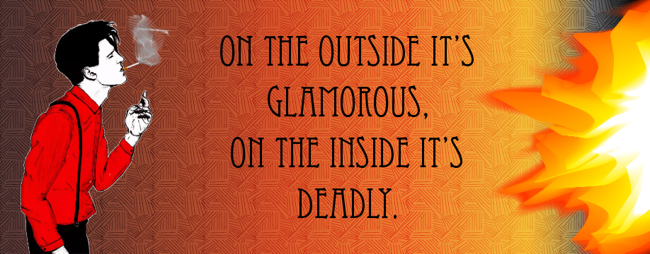
I believe that I did a good job in this assignment. The hardest and longest part of this project was drawing the guy in the red shirt. I originally had drawn him a while ago, but then I had to use image tracing and a blob brush to merge the cigarette in between the lip. I learned how to create flames and a cigarette, smoke, and how to combine the background gradients with a pattern. When I drew the guy, it made smoking look glamorous. I decided that since smoking ISN'T, in fact, glamorous, I made sure it was known. Hence my wording in the ad, "On the outside it's glamorous, on the inside it's deadly."
|
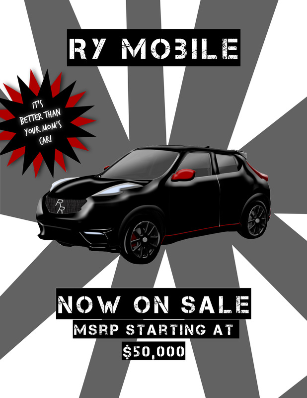
Car AdThis project was to design or draw a car, and to make it look good. I used the pen tool, bevel and emboss, lighting effects, text, layer effects, and the brush tool. I completed the assignment in Photoshop and then saved it as a .jpg. I believe my knowledge of Photoshop really grew during this project.
|
|
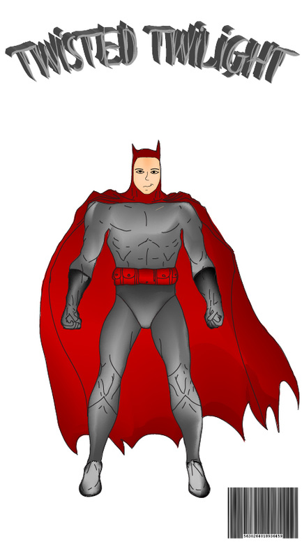
Superhero Comic BookThe "Superhero Comic Book" project was very intricate and detailed. There were little things for every piece of it. I had missed a few days of school, so I didn't get to fully complete the project. I learned how to use the mesh tool and the pencil tool. I didn't really like the project, but it's good that I learned the tools.
|
|
Final Exam Task - Create A .GIFThis was our final exam task: we had to create a gif.
|
Journals
My name is Riley Ramos, and I am enrolled in a digital art class. Learning Illustrator & Photoshop is valuable because you will have skills that many other people don't. It is easier to get a job in the art & design field because of those skills and the amount of knowledge you have in those fields.
One of the most important design concepts I learned in this class was contrast. It is defined as the difference between two objects, people, places or color. The root contra is Latin and means "against." Contrast is important because if your art doesn't have it, everything will be hard to see and nothing will stand out or "punch you in the face" (Harris, 3/18). One way to create contrast is to have a light and dark color, or opposites. Another way is to create contrast is to have an object outlined, such as a stroke around it, or to add shading/tinting to the color of one of the objects.
I believe that my best work for this class was the "Stop Smoking Ad". I took a long time on that project, and I tried to perfect it. I like it because the guy on the left makes smoking look glamorous or attractive (which it sometimes is), and then added fire on the other side of the ad to make it look like the ad was burning away. I chose it as my best work because of how much detail I drew on the guy.
